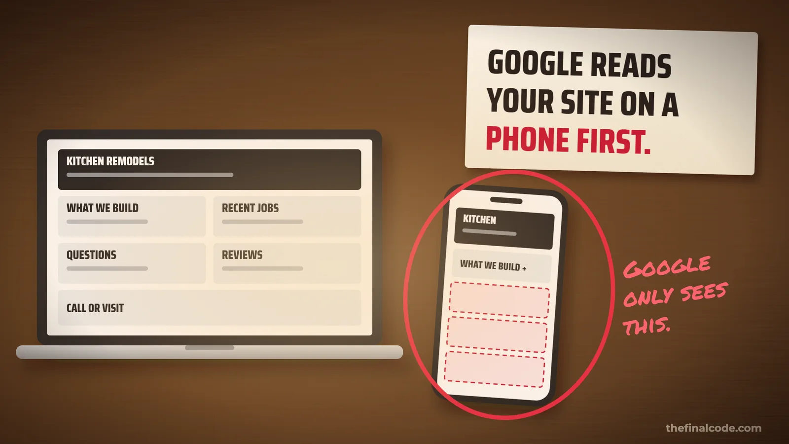
Google Reads Your Website on a Phone First. Here's What It Sees.
Here is how most websites get approved. Everybody gathers around a big screen in the office, scrolls through the new site, and says it looks great. Then it goes live, and the most important reader it will ever have opens it on a phone. As an SEO company in Santa Barbara, we think every owner should know who that reader is.
It is Google. And Google says so in the first line of its own guide.
Google uses the mobile version of a site's content, crawled with the smartphone agent, for indexing and ranking.Google Search Central, Mobile site and mobile-first indexing best practices
That has a name, mobile-first indexing, and it means something simple. The version of your website that counts is the one on a phone. Not the one you signed off on.
One website, two different readers
For a lot of sites, the phone version is the same page, just stacked up narrower. That is fine. Google has no complaint about that at all. The trouble starts when the phone version is not the same page, because somebody trimmed it to fit.
On the phone, the jobs in Montecito and the answers people need before they hire you are simply not there. So as far as Google is concerned, they are not anywhere. Google is plain about what happens when the phone version carries less than the desktop one.
you can expect some traffic loss when your site is enabled mobile-first indexing, since Google can't get as much information from your page as before.Google Search Central, Mobile site and mobile-first indexing best practices
Tucked away is fine. Cut out is not.
Here is the part that surprises people, and it is good news. You do not have to cram every paragraph onto a small screen. Folding things into a menu you tap to open is fine. Google even suggests it.
Instead of removing content, consider moving content into accordions or tabs to save space.Google Search Central, Mobile site and mobile-first indexing best practices
What Google will not do is go tapping around to find things. In its own words: “Google won’t load content that requires user interactions (for example, swiping, clicking, or typing) to load.” So text that sits on the page, folded up, still counts. Text that does not arrive until somebody taps a button does not. Here is the whole difference in one place.
- Text folded into a tap-to-open sectionIt is already on the page, just closedCounts
- A section deleted from the phone versionTo make the page shorterGone
- Reviews or details that only load after a tap"Load more", "See all", a swipeMissed
- A different page title on the phoneGoogle reads the phone onePhone wins
- Photos with no description on the phoneAlt text missing from the phone versionMissed
- The same page, stacked narrowerWhat a responsive site doesCounts
That last row is the one to aim for. Google recommends responsive design, one page that rearranges itself for the screen, “because it’s the easiest design pattern to implement and maintain.” Same words on every device, so there is nothing to fall out of step.
Check your own site in five minutes
No tools needed. Just the phone in your pocket and the page you care about most.
- Open it on your phone, not your computerOn mobile data, the way a customer would, not the office WiFi.
- Read it top to bottomIs everything from the desktop version there? Every service, every answer, every job you are proud of? Missing is the problem. Folded up is fine.
- Tap anything that says "more"If reviews or details only appear after that tap, Google is not seeing them.
- Check the headline at the top of the tabIt should say the same thing on the phone as it does on your computer.
- Find the main video or photoGoogle says it "might harm the video's ranking" if people have to scroll too far down the phone page to find it.
If the page is also slow on a phone, that is a separate problem with its own fix, and we went through it in whether a slow website is costing you rankings. And if your site runs on a website builder, the theme decides most of this for you. Google’s own guide says a site on a builder like Wix might need a new mobile-friendly theme if the current one cannot be changed. We covered what those builders do and do not get in the way of in whether Wix or Squarespace is bad for SEO.
Build it once, for both readers
The fix is not two websites. It is one website that says the same thing everywhere and simply rearranges itself to fit the screen. That is how we build them, so the version Google ranks is the version you approved. You can see how that works on our websites and ecommerce page.
Send us your website. We will show you what the phone version is missing, what Google can and cannot see on it, and what to fix first. No charge, and no obligation. Or call or text 805.243.8321.
Get My Free Visibility ReportYour customers are looking at your website on a phone. So is Google. Making sure they both see the whole thing is the least glamorous and most dependable part of SEO.